Waltham Forest Fashion has worked in close collaboration with Fashion District and local design studio, Egg, to create a new brand identity that reflects their unique network of strong sustainable fashion businesses.
From long established businesses that have grown up and worked in the area, to a new wave of local fashion pioneers, there’s a new generation of changemakers on the rise. All share a common entrepreneurial spirit, community driven ethos and a vision to transform the way we produce and consume clothing, and manage its impact – both on society and the environment. With the help of Egg, we’ve created a vibrant and exciting platform to portray that message.
Egg’s research into the borough’s art and design heritage and conversations with local fashion businesses unearthed a rich and creative story. They listened to a diversity of voices and explored the functional aspect of fashion, it’s creativity, as well as current marketing trends. The result takes inspiration from Waltham Forest’s cultural heritage, the Arts & Crafts Movement, and brings it into a more contemporary space, creating a fusion between history and evolution.
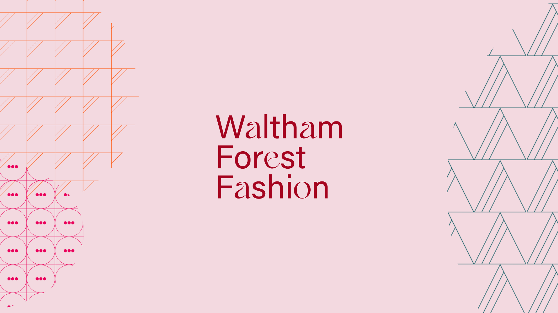
With an increasing focus on sustainability, Egg also wanted to look at how clothes are made, worn, washed, and looked after long-term and were inspired by the graphic symbols found in our simple everyday washing labels. As they transformed them into a series of repeat patterns they became reminiscent of the floral print designs associated with William Morris and the arts and crafts movement. A combination of the current and the past.
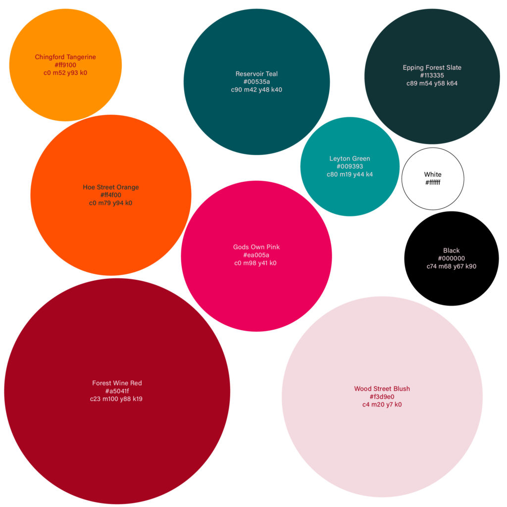
The colour palette is inspired by the diverse people and places of the borough with names linked to well-known locations in Waltham Forest:
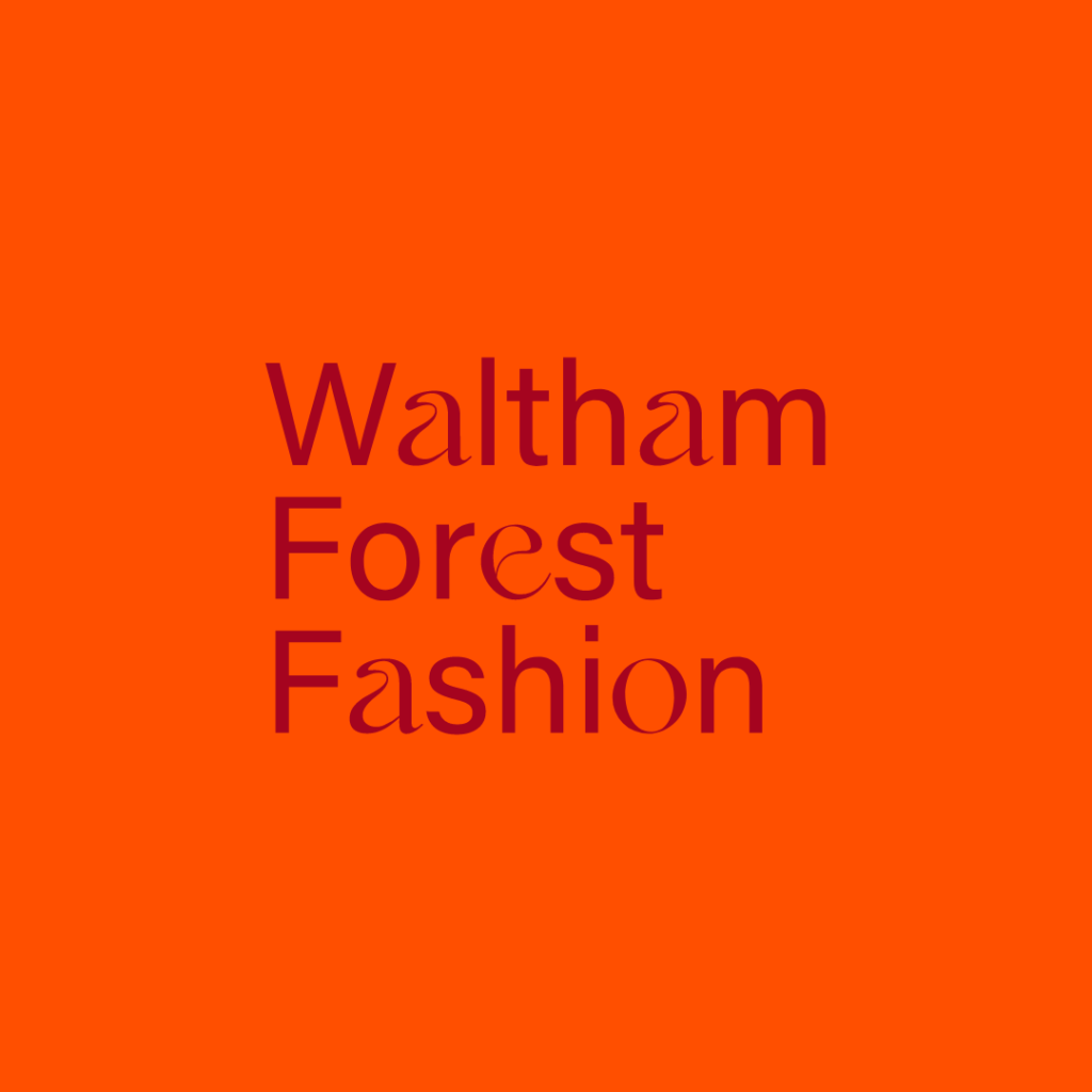
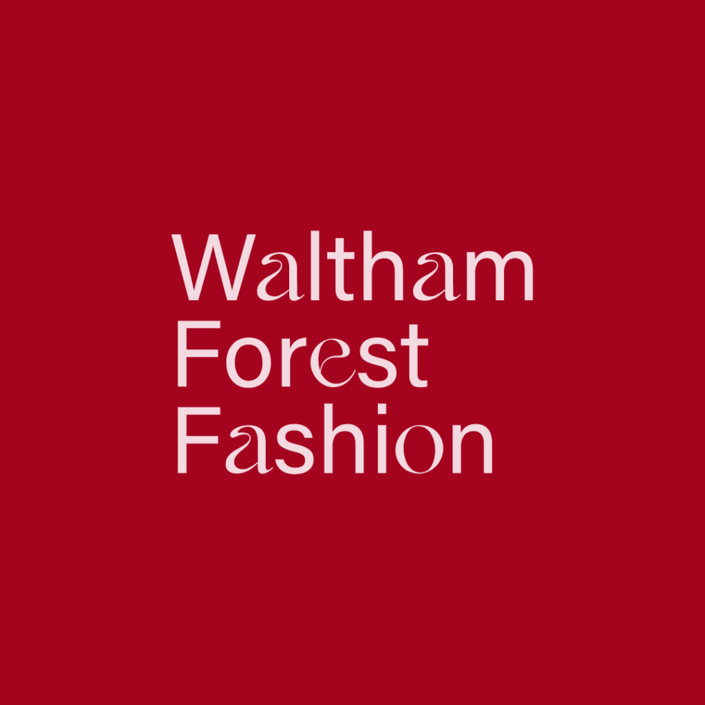
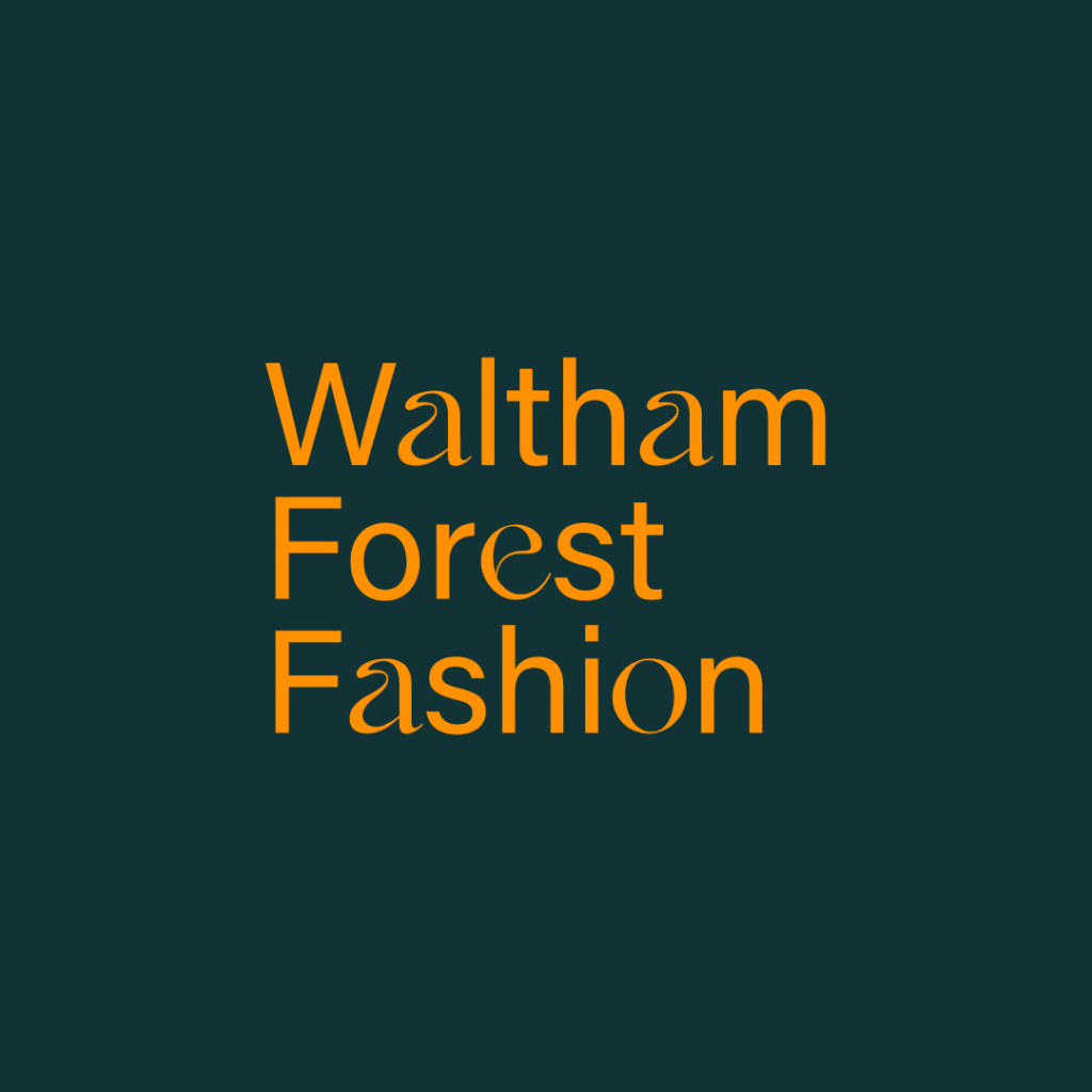
For the main logo, Egg used a combination of fonts fused together mixing decorative with instructive. Acumin, the sans serif font has a balanced, clear and rational quality, and Kaftan Serif, a highly elaborate font full of lovely idiosyncrasies pays tribute to the design heritage of Waltham Forest.
Egg’s design story for Waltham Forest Fashion embodies both the functional and self-expressive side to our fashion community. There are endless combinations of background colours and graphics to showcase businesses in their very best light. A timeless, flexible identity that can shift, bend and grow side by side with the Waltham Forest Fashion community. We hope you love it as much as we do.